

The Olympic Games have long been a global celebration of athletic prowess, cultural exchange, and international unity. As one of the world’s most-watched sporting events, the Olympics offer a unique opportunity for host cities to showcase their countries in the best way to a global audience. Over the years, Olympic branding has evolved significantly, reflecting changing design trends, cultural influences, and technological advancements. Let’s take a journey through the Olympic Games’ iconic branding from 2000 to 2024 and explore how these changes relate to the expertise of creative branding agencies like TriVision.
Sydney 2000: Embracing Modernity
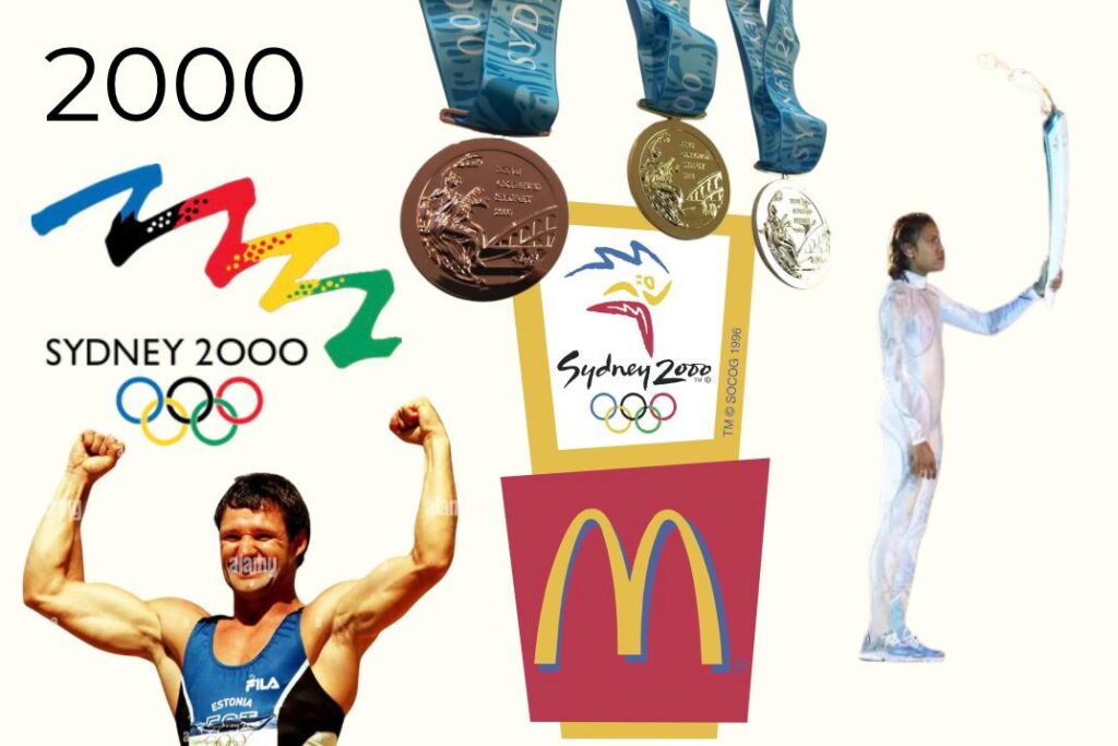
The Sydney 2000 Olympics marked a new era of branding, with a focus on modernity and inclusivity. The logo featured the iconic Sydney Opera House integrated into an athlete’s silhouette, symbolizing the harmony between Australia’s cultural landmarks and the spirit of the games. This design set a precedent for future Olympic logos, emphasizing the importance of integrating local culture with global themes.
Athens 2004: Celebrating Heritage

The Athens 2004 Olympics returned to the birthplace of the ancient games, inspiring a branding strategy that celebrated Greece’s rich heritage. The olive wreath logo, combined with classical typography, paid homage to the ancient Olympics while incorporating a contemporary twist. This blend of tradition and modernity highlighted the Games’ historical significance and relevance in today’s world.
Beijing 2008: A Fusion of Art and Technology
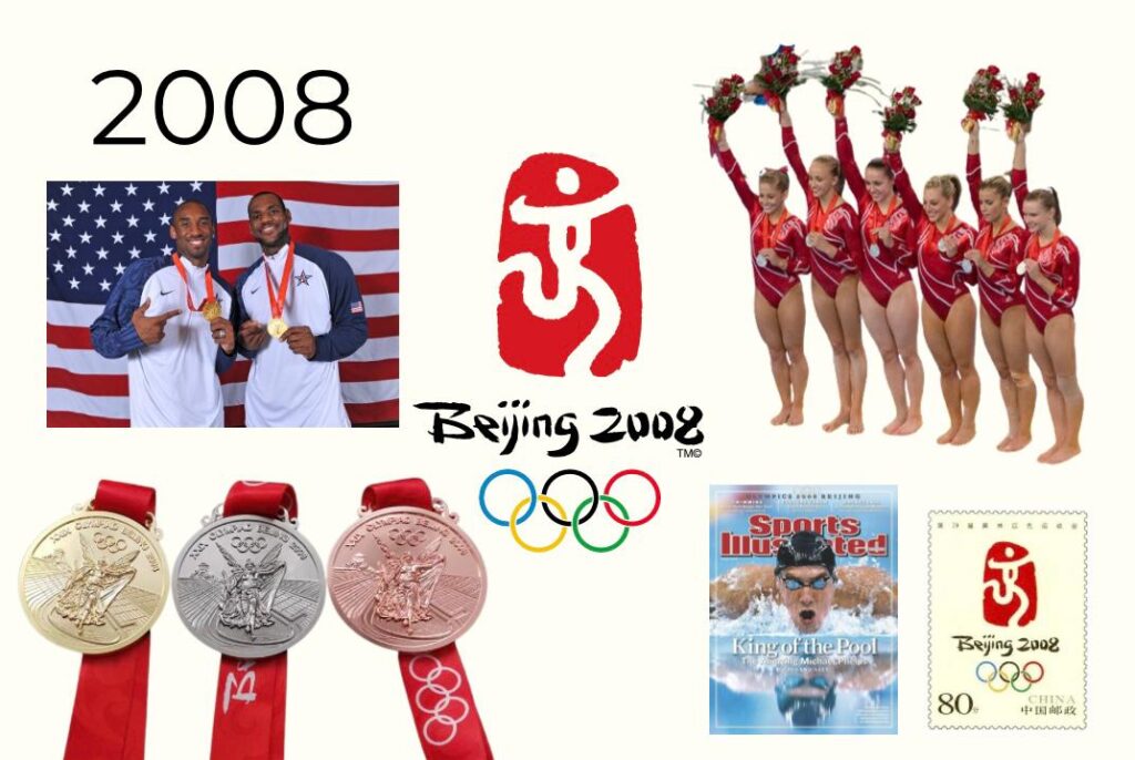
Beijing 2008 took Olympic branding to new heights by fusing art and technology. The “Dancing Beijing” logo, a stylized depiction of the Chinese character “京” (Jing), showcased China’s artistic heritage and forward-thinking vision. This blend of cultural symbolism and modern design demonstrated how brands could leverage technology to create dynamic visual identities.
London 2012: Bold and Controversial
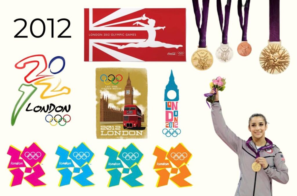
The London 2012 Olympics broke from traditional design norms with a bold, abstract logo that sparked debate worldwide. While some praised its modernity and uniqueness, others found it confusing. Despite the controversy, the branding succeeded in generating buzz and drawing attention to the Games. This daring approach highlights the power of bold branding choices in capturing audience attention.
Rio 2016: Vibrant and Dynamic
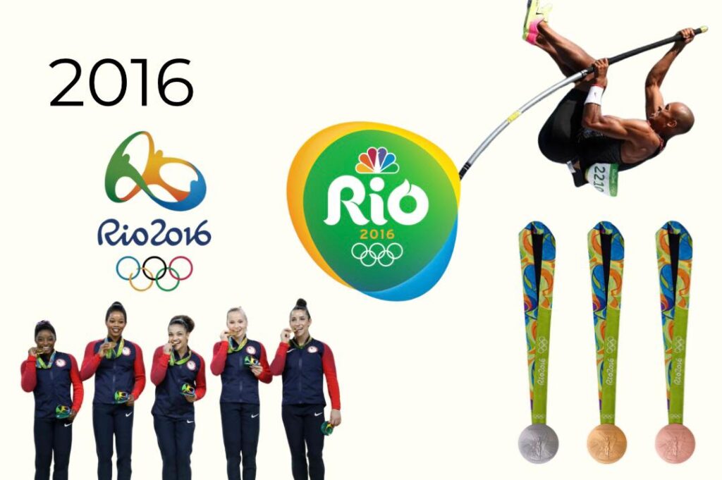
Rio 2016 embraced the vibrant spirit of Brazil with a dynamic logo featuring three figures joining hands to form the Sugarloaf Mountain, a symbol of unity and celebration. The vibrant colors and fluid shapes reflected the energy and diversity of Brazilian culture, demonstrating the importance of aligning branding with the host country’s identity.
Tokyo 2020: Innovation Amid Challenges
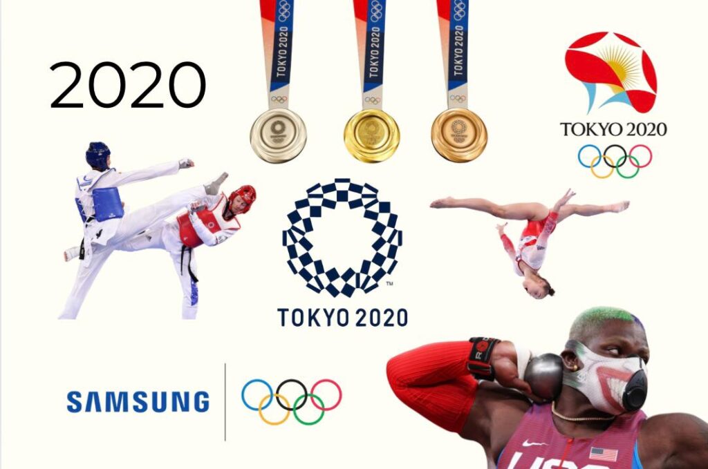
The Tokyo 2020 Olympics faced unprecedented challenges due to the COVID-19 pandemic, leading to a postponed event with unique branding needs. The logo, inspired by traditional Japanese motifs and modern minimalism, symbolized unity and resilience. This branding strategy underscored the importance of adaptability and innovation in the face of adversity.
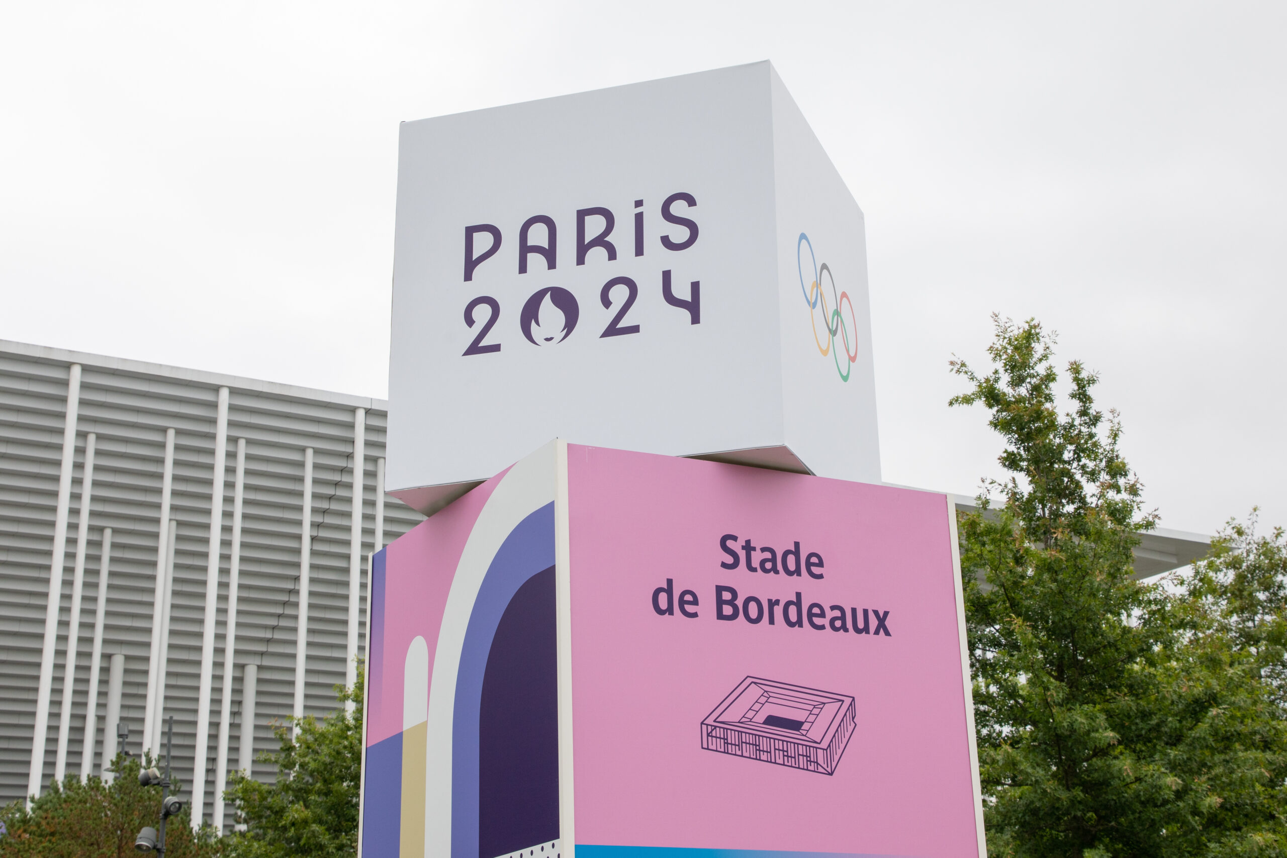
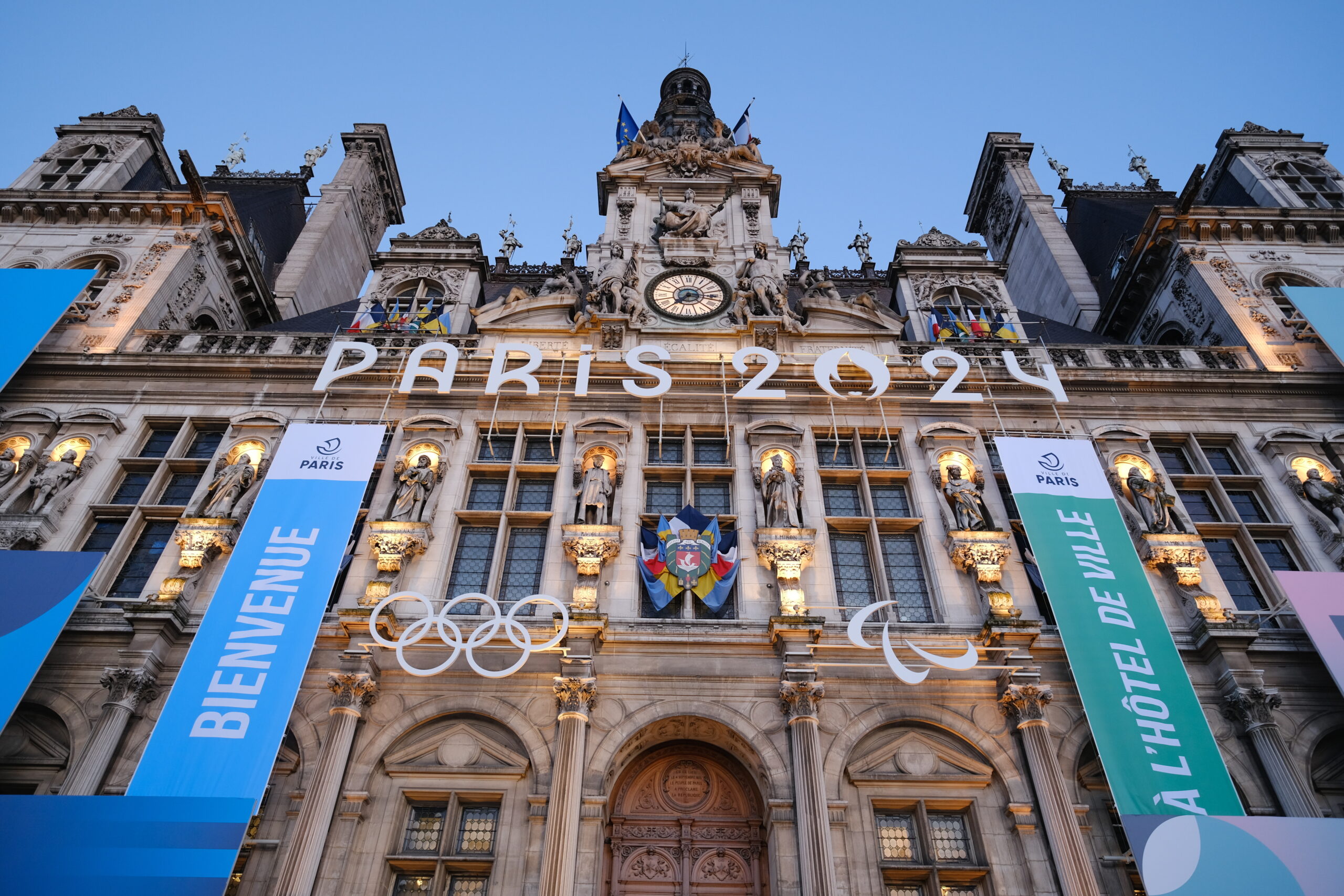
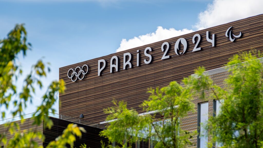
Paris 2024: Inspired by French History
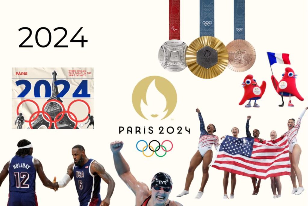
The Paris 2024 Olympics branding promises to celebrate the host city’s rich history, iconic landmarks and artistic heritage. The design of the Paris 2024 Olympics logo emblem combines three iconic symbols: the gold medal, the flame, and the face of Marianne—a beloved symbol of the 1789 revolution and French people. According to the Olympics website, “Marianne is the personification of the bold spirit of creativity that inspires our Games.” This approach highlights the ongoing trend of merging local culture with universal Olympic values.
Inside the Branding of Paris 2024 Olympics
The 2024 Summer Games mark the first time Paris has hosted the Olympics in a century. This prompted Conran Design Group, the firm behind the Paris 2024 Olympic and Paralympic Games branding, to establish a brand foundation by exploring trends from 100 years ago using Orphism, a Parisian art movement from the early 20th century that evolved from Cubism.
Although Conran didn’t create the Paris Olympics logo, it built everything else at the Games, which includes all the colorful banners, backdrops, signs, and the mascots. Embracing the mantra “Games Wide Open,” the brand aims to infuse the city with a sense of play while fostering inclusion at the Games.
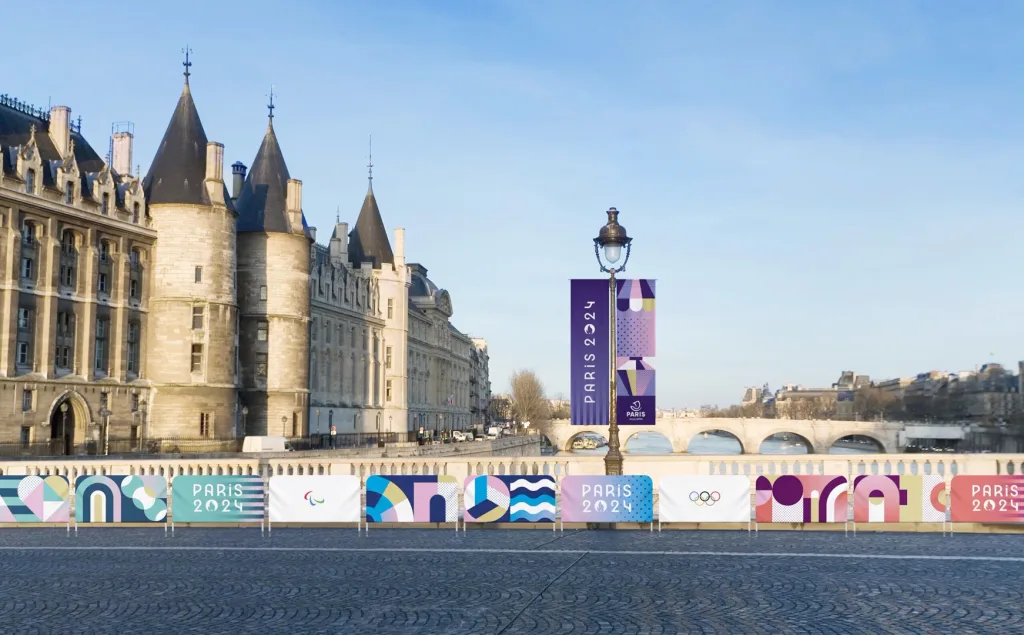
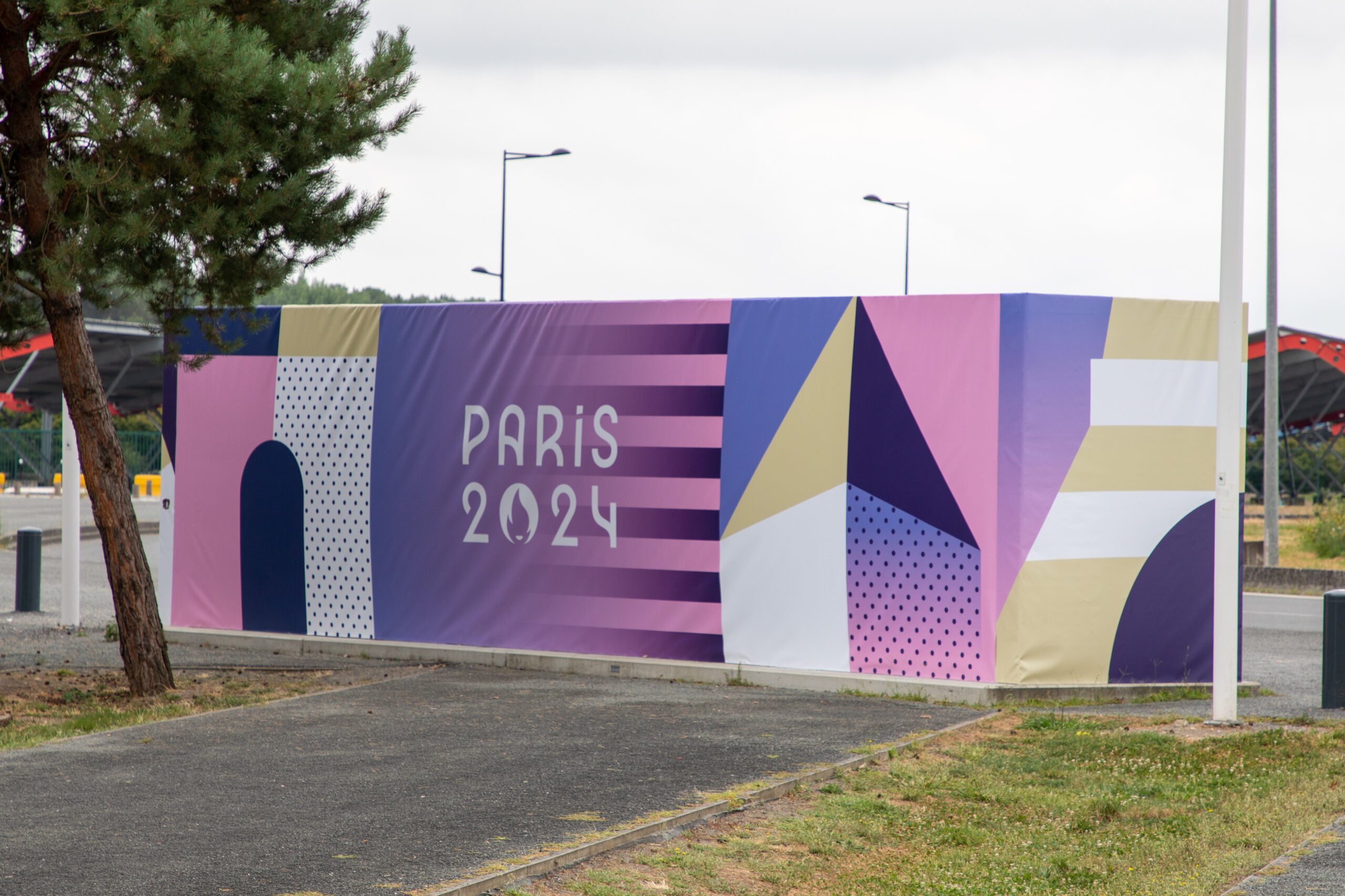
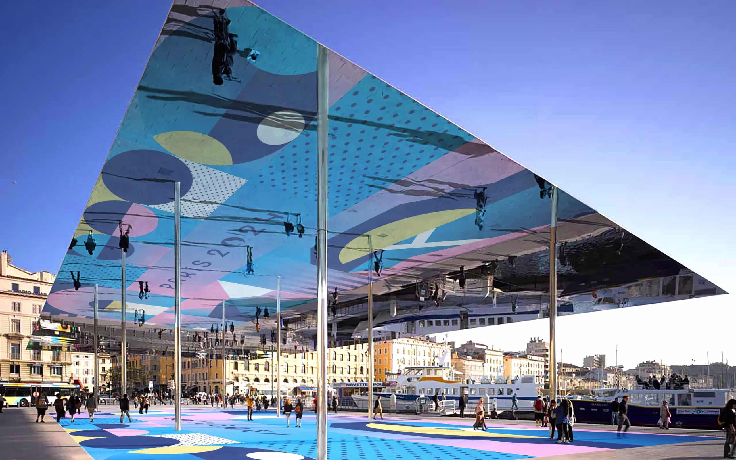
The Color Palette
The color palette selected for the branding was a direct response to Paris’s sandstone architecture. “We wanted to have a colorful palette that was playing with this attribute, and adding some festivity to the city,” said Anaïs Guillemané Mootoosamy, Designer and Strategy Director at Conran Design Group. Given Paris already had blue water and green grass, the team went with light pink as their hero color supported by a wider palette of colors, including purples, greens and blues.
The Olympic Medals
The Paris 2024 Olympic medals were designed by French conglomerate LVMH which owns luxury brands like Louise Vuitton and Christian Dior. Designed by French designer Maison Chaumet, these medals express the shared vocation of LVMH and the renowned Paris jeweler: The Art of Crafting Dreams.
Chaumet drew inspiration from its rich heritage and evocative stylistic repertoire, along with iconic symbols of France and Paris, to create a truly unique design that fuses tradition and modernity. Through striking creativity and innovation, Chaumet has reinvented the most coveted award for elite athletes. The medal design is confident and bold, perfectly reflecting the extraordinary feats of the athletes.
The Typeface: Art-Deco Inspired
A typeface that embodies French elegance, the Paris 2024 font is versatile, offering variations from hairline thin to extra-bold. It was specifically crafted to seamlessly adapt to all digital text formats.
Click to view the official brand style guide for the Paris 2024 Olympics Brand Identity.
The Role of Creative Agencies in Branding Global Events
The evolution of Olympic branding over the years reflects broader trends in design and branding. For creative branding agencies like TriVision, the Olympics serve as a powerful example of how to create impactful, culturally resonant visual identities. By blending local influences with global themes, TriVision can help brands craft unique stories that resonate with diverse audiences.
With over 25 years of experience in creative branding serving the Washington DC area, TriVision understands the importance of adapting to changing trends and leveraging cultural insights to create memorable brand experiences. Whether it’s developing a bold new logo, designing dynamic visuals, or crafting compelling narratives, TriVision’s expertise ensures that brands can stand out in today’s competitive landscape.